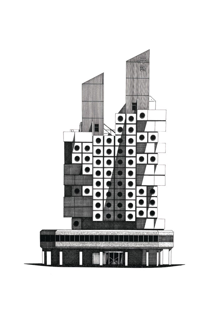
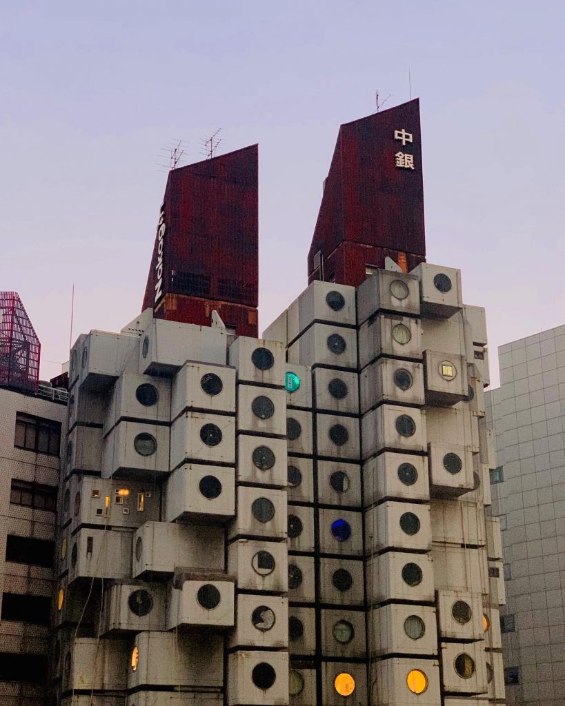
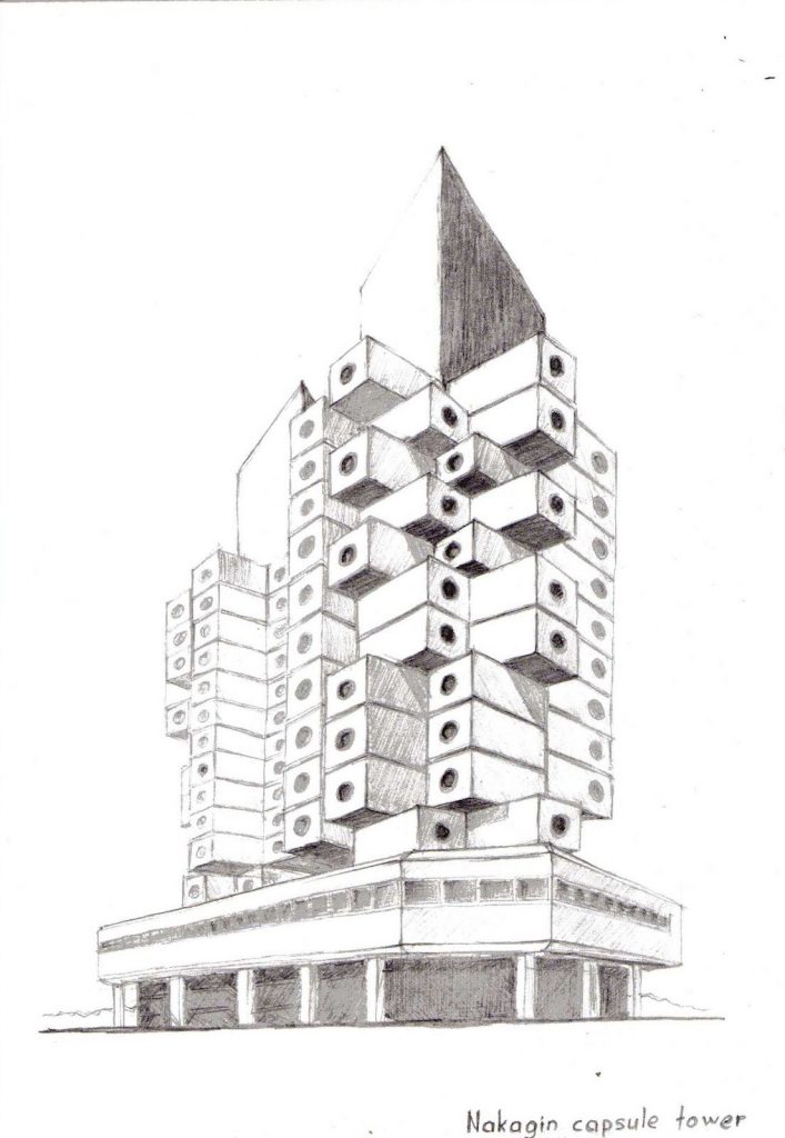
NAKAGIN CAPSULE TOWER
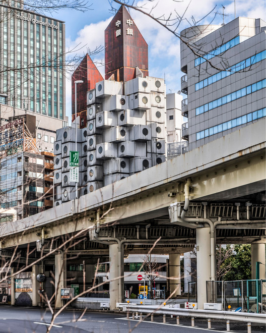
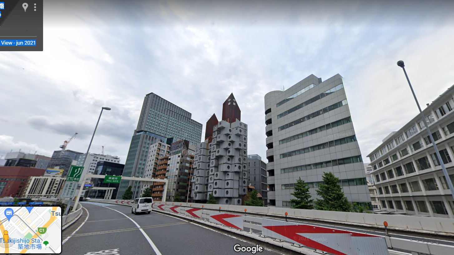
This construction is one of the best examples of Japanese metabolistic architecture, it was built in 1970 in Shimbashi, Tokio, Japan.
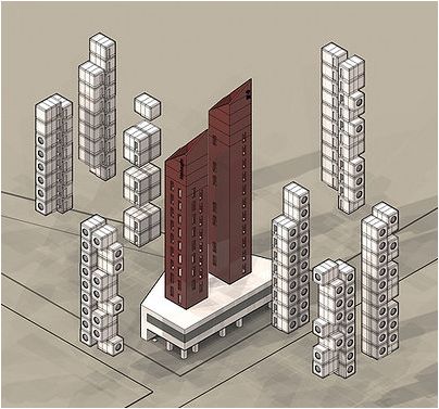
The building is made up of two interconnected concrete towers
· One with eleven and the other with thirteen floors
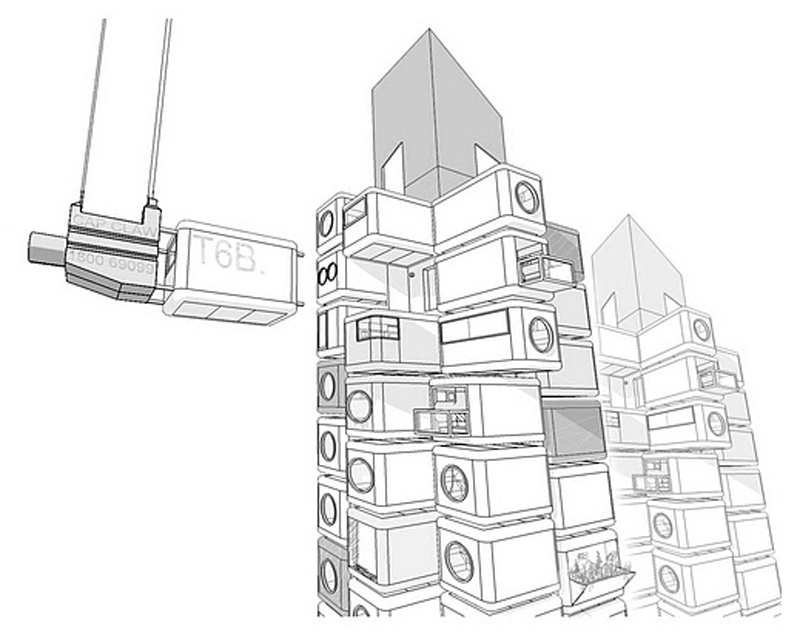
· With 140 prefabricated modules that are self-contained units.
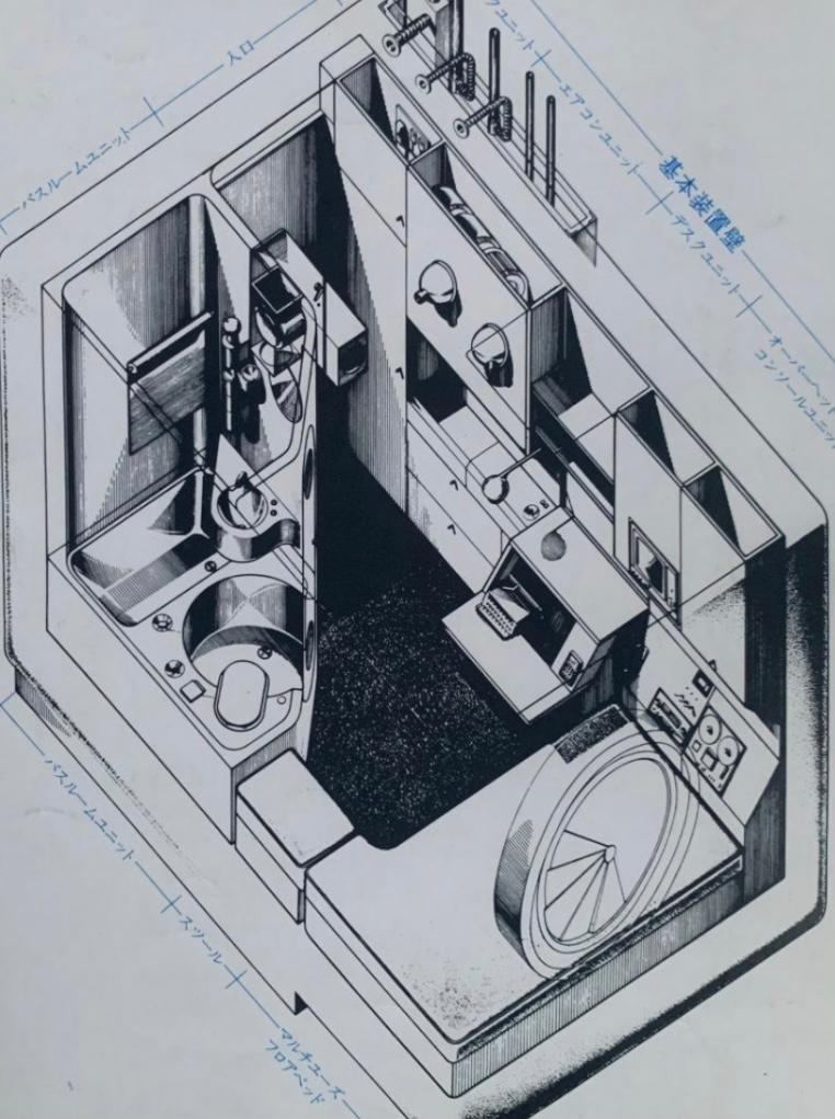
·Each pod measures 2.3m x 3.8m x 2.1m and functions as a small residence or office.
·The capsules can be connected and combined to create larger spaces.
The analysis of the form
Rythm
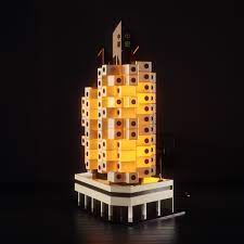
Despite the fact that they are industrial-scale constructions that are repeated, Kurokawa tries to break with the rhythm of a repetitive facade by changing the placement of the capsules in a way that seems arbitrary, a fact that shows the ease that he intended to give of mobility and independence of each unit.
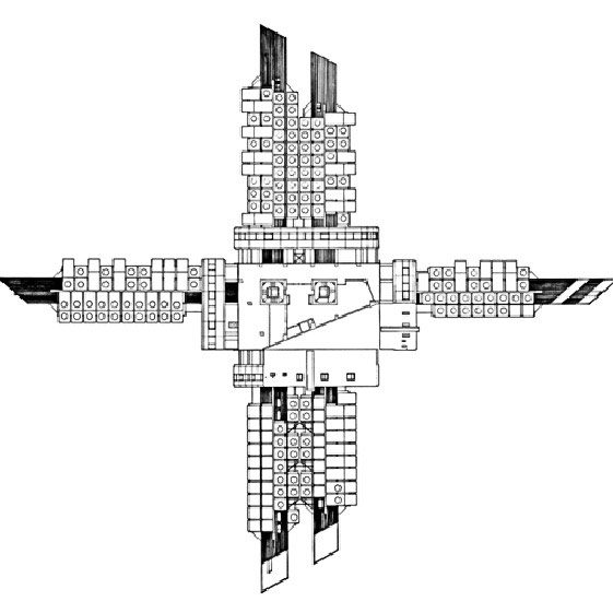
Axis and Grid
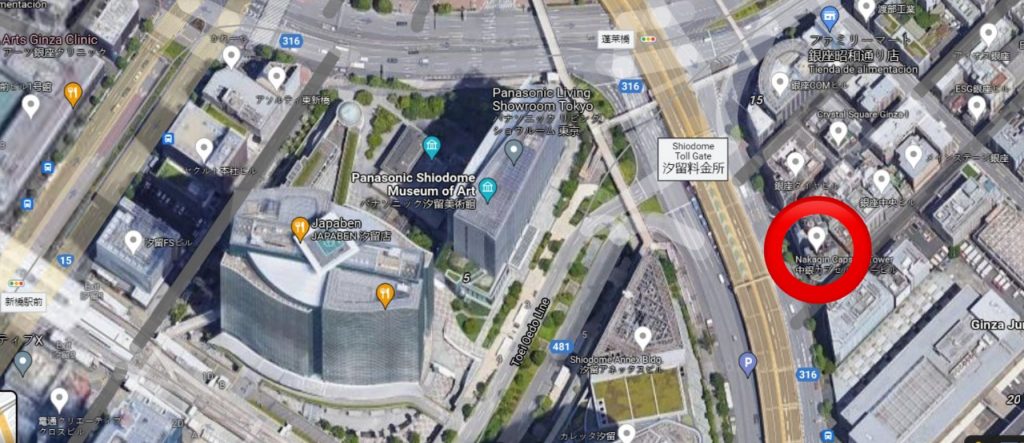
It stood out in its environment when it was built and continues to stand out today, since despite being in an urban environment within Shimbashi of tall building constructions, its shape makes you notice it. It is marked by a clear vertical axis that distributes the departments by floors
Symmetry
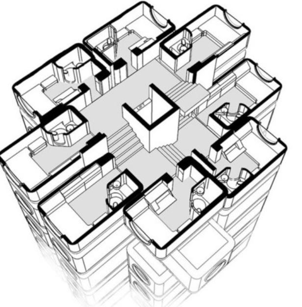
From its plan we can see the central symmetry that it has due to the arrangement of the parts in a regular way with the center, which rotate around it forming a pattern. Therefore, despite the fact that from its façade we do not find an exact symmetry due to the placement of the capsules, we do find it if we see it in a horizontal section.
Module
This building is one of the best examples of modular architecture, since it is made up of independent and repetitive modules that act independently.
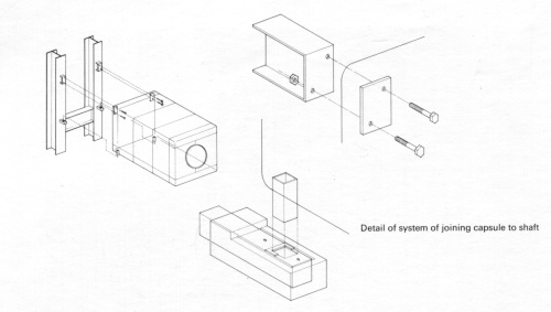
Each capsule is connected to one of the two main cores by just four heavy duty screws and are designed to be replaceable, although no units have been replaced since original construction.
Movement
It is not an organic building that flows with the space, on the contrary it highlights its straight lines since it does not intend to fit in but rather to mark its identity throw it’s rectangular cubes and round windows.
Limits and Light
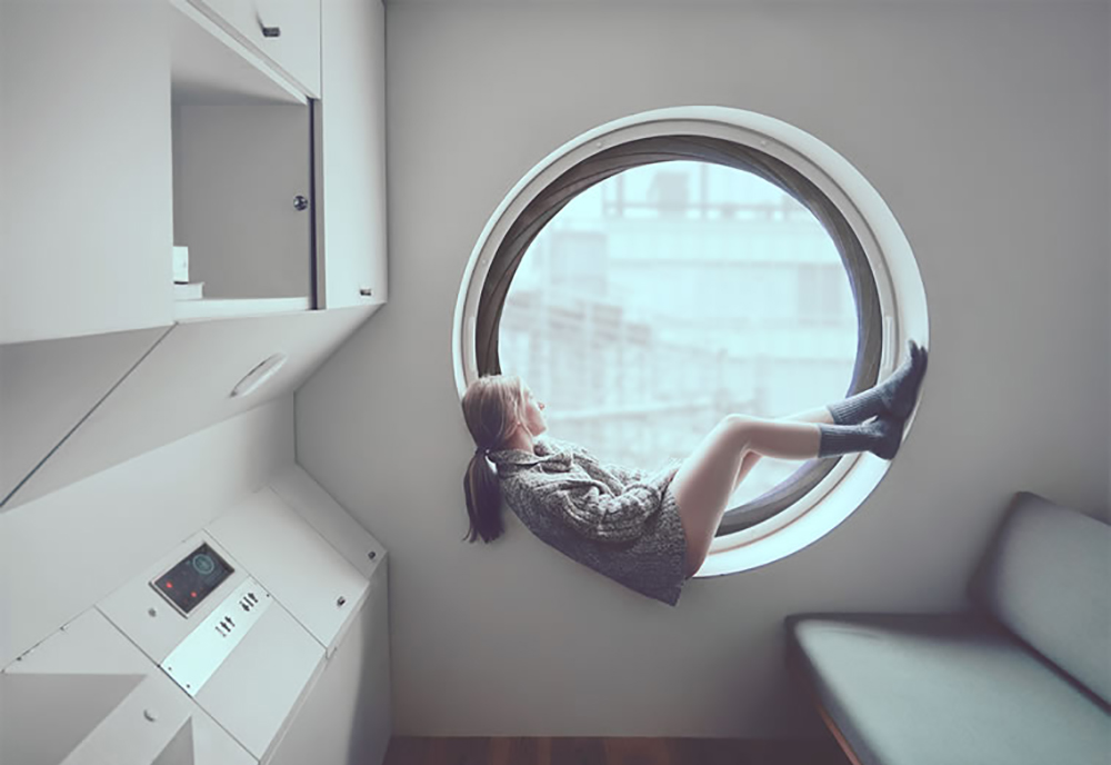
By using concrete both outside and inside the building, a cold architecture is formed that does not mark an exact limit between the interior and exterior with changes of color or textures as we can see in most buildings. A change in situation can be the space that the house represents once you are inside since being so small and with that huge window you can perceive sensations of feeling more open to the outside and not having so much in mind the limit that it means to be outside and inside. From this aspect, you can see the fundamental role that the window plays in the distribution of space since it is the only contact of exterior light that there is, but it is large enough to supply the space in a very original way that can make us feel that we are inside a submarine or a spaceship.
Contrast
The contrast it has with the other buildings is not very drastic due to the fact that it is built of concrete like most of the surrounding buildings, its style is contemporary without ornamentation, it was innovative when it was built and its architect Kisho Kurokawa, who belonged to the group of japanese metabolist architects, always tried to integrate the Japanese tradition in their buildings in a subtle way but always keeping it in mind as a reference as his group did.
Colour
Regarding the use of color, in these buildings we can only see the red of the tips since the concrete was left as an outer layer showing a monotonous gray.
With this we can think that the architect’s objective was not to make the building striking because of its striking or unusual color changes, but because of its design.
Texture
Nor does it stand out for its texture since noble materials were used with their original finishes and without different or daring finishes. So, from what you can see with the superior metal and cement it gives the impression of a cold and industrial texture.
Unity and Centrality
As can be seen clearly in the elevation, all the departments come together in the center, which is represented as the central figure of the building. It is a contemporary building that continues exciting for its originality and unity since it brings together the different departments through a single common center from which the building is accessed and exited.
Hierarchy
Seen from the outside and comparing it with the buildings that surround it, it can be clearly seen that it is one of the smallest since much taller buildings are currently being built and it is one of the few that remain standing from that time.
Balance
Although it does not present an exact symmetry seen from the outside, the uniformity of its construction shows a balance of colors and shapes.
Proportion and Scale
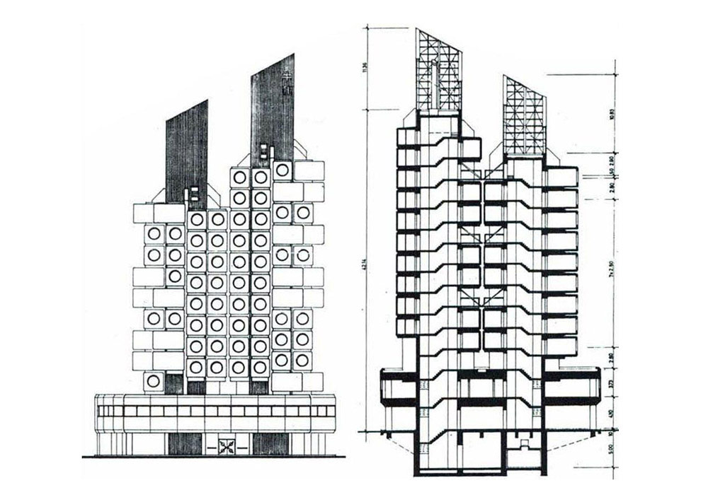
Its proportions for being a 13-storey building the tallest, are 54 meters high (36 people of one and a half meters or 27 of two meters) by 3000 square meters of surface. With these proportions even at that time, he did not want to stand out for his height, but for his architectural innovations.